Tailwind CSS Flex and Grid
Let’s explore utility classes for working with Flex and Grid in Tailwind CSS. Flexbox and Grid can be utilized in Tailwind CSS to create responsive and flexible layouts with minimal effort.
Flex
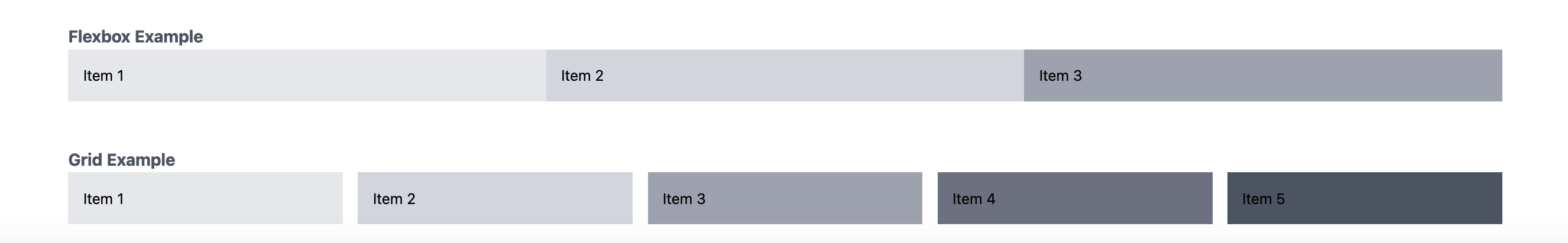
This section demonstrates the use of Flexbox in Tailwind CSS. The flex class is used on the parent container to create a flex container. The justify-between class is applied to evenly distribute the child elements along the main axis (horizontally) with space between them. Each child element has flex-1 class to make them grow and fill the available space equally.
1
2
3
4
5
6
7
8
9
<div class="container mx-auto py-6">
    <!-- Flexbox Example -->
    <p class="text-lg text-left text-gray-600 font-bold">Flexbox Example</p>
    <div class="flex justify-between">
        <div class="flex-1 bg-gray-200 p-4">Item 1</div>
        <div class="flex-1 bg-gray-300 p-4">Item 2</div>
        <div class="flex-1 bg-gray-400 p-4">Item 3</div>
    </div>
</div>
Grid
This section showcases the usage of Grid in Tailwind CSS. The grid class is used on the parent container to create a grid container. Different grid-cols-{number} classes are applied to define the number of columns at different screen sizes. The gap-4 class adds a gap of 1rem between grid items.
1
2
3
4
5
6
7
8
9
10
11
<div class="container mx-auto py-6">
    <!-- Grid Example -->
    <p class="text-lg text-left text-gray-600 font-bold">Grid Example</p>
    <div class="grid grid-cols-1 sm:grid-cols-2 md:grid-cols-3 lg:grid-cols-4 xl:grid-cols-5 gap-4">
        <div class="bg-gray-200 p-4">Item 1</div>
        <div class="bg-gray-300 p-4">Item 2</div>
        <div class="bg-gray-400 p-4">Item 3</div>
        <div class="bg-gray-500 p-4">Item 4</div>
        <div class="bg-gray-600 p-4">Item 5</div>
    </div>
</div>